
TESTING METHODOLOGY
The methodology of the P3 connect Mobile Benchmark is the result of P3’s many years of experience. It was carefully designed to evaluate and objectively compare the performance and service quality of the UK’s mobile networks from the users’ perspective.
The P3 connect Mobile Benchmark took place throughout September 2017. All samples were collected during the day, between 8am and 10pm. The network tests covered 20 large cities with more than 100,000 inhabitants. Measurements were also taken in smaller towns as well as on trunk roads and motorways. The combination of test areas had been selected to provide a significant series of test results covering the UK population in England, Scotland, Wales and Northern Ireland. The areas chosen for the 2017 test account for more than 17 million people, or approximately 27% of the total population of the UK.
P3 conducted the tests with four drivetest cars, equipped with arrays of Samsung Galaxy S7 Cat 9 smartphones as well as a mixed allocation of Samsung Galaxy S7 and Sony Xperia XZ Cat 9 smartphones for simultaneous measurement of voice and data services. Additionally, two teams conducted the walktests, also measuring voice and data performance.
Voice testing
Two smartphones per operator in each car plus four smartphones per operator in the walktests were used for voice evaluation. They were setting up test calls between each other – from car to car and from each walking staff member to a stationary counterpart. The audio quality was evaluated based on the HD-voice capable and ITU standardised so-called POLQA wideband algorithm. All UK operators offer 4G capable subscriptions. All of the smartphones in the voice tests were set to 4G preferred mode. This reflects the common behaviour of customers. When a 4G connection, but no VoLTE was available, this would force the smartphones to switch (“fall back”) to 2G or 3G for the voice calls (so called “circuit-switched fall back” or CSFB). In 4G networks with VoLTE support, the phones would prefer this voice mode. In order to further reflect typical smartphone use scenarios during the voice tests, background data traffic was generated in a controlled way through random injection of small amounts of HTTP traffic. The voice test scores account for 38.8% of the total benchmark results.
Data testing
Data performance was measured using one smartphone per operator per car. Two of the drivetest cars were equipped with four Samsung Galaxy S7 each while the other two were carrying four Sony Xperia XZ each. This setup was chosen in order to respect the variable data performance of different smartphones in different networks. For the data walktests, each of the two teams carried one Galaxy S7 per operator. In total, the drivetest cars carried 16 devices for the data tests and the walktest teams carried eight devices. For all data test devices, the radio access technology was set to LTE preferred mode.
The web tests accessed web pages according to the widely recognized Alexa ranking. In addition, the static “Kepler” test web page as specified by ETSI (European Telecommunications Standards Institute) was used. In order to test the data service performance, files of 3MB and 1MB for download and up- load respectively were transferred from or
to a test server located on the Internet. In addition, the peak data performance was tested in uplink and downlink directions by assessing the amount of data that was transferred within a 7 seconds time period. Another discipline was the playback of YouTube videos. It took into account that YouTube dynamically adapts the video resolution to the available bandwidth. So, in addition to success ratios, start times and playouts without interruptions, YouTube measurements also determined the average video resolution.
All tests were conducted with the best- performing mobile plan available from each operator and in a full drive and walktest mode. Data scores account for 58.2 per cent of the total results.
Routes and samples
The test routes are shown on page 1 of this report. In the big cities and smaller towns indicated, the cars had to follow predefined routes. Altogether, the four test cars covered more than 4700 miles, of which approximately 2750 miles led through the big cities, while 1950 miles were covered in smaller towns and on connecting roads.
Performance indicators and rating
The score weighting reflects both the geo- graphical distribution of the UK population
and the ranking of usage scenarios. Therefore, 582 of the total of 1000 maximum points were assigned to the cities – 233 maximum points refer to the voice results and 349 maximum points reflect the data results. For the towns and the roads, a maximum of 194 points each is available. In both categories, the possible maximum is 78 points in the voice, and 116 points in the data category. The table on page 2 of this report shows the percentage of maximum points that each operator has achieved in each discipline.

Three boxes were mounted into the back and side windows of each measuring car in order to support twelve smartphones per car.
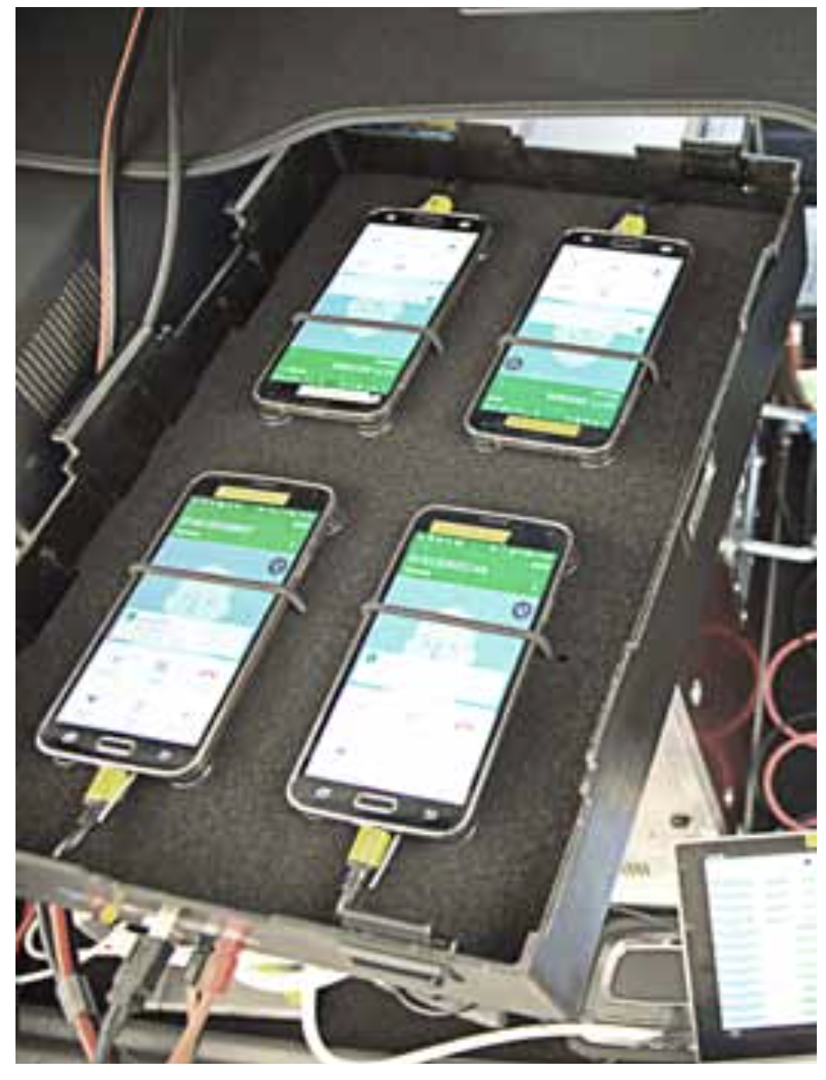
Each box was housing four smartphones which allowed the simultaneous testing of four mobile operators.

Hakan Ekmen, CEO, P3 communications GmbH and Bernd Theiss, Head of connect’s test lab, inspect the testing equipment.

Crowdsourcing operational excellence
The remaining 30 points are awarded for operational excellence. For this survey, P3 uses a crowdsourcing method. To acquire these data, P3 considers connectivity reports that are gathered by background diagnosis processes included in a number of popular smartphone apps. While the customer uses one of these apps, a diagnosis report is generated daily and is evaluated per hour. As such reports only contain information about the current network availability, it generates just a small number of bytes per message and does not include any personal user data.
In order to differentiate network glitches from normal variations in network coverage, we apply a precise definition of “service degradation”: A degradation is an event where data connectivity is impacted by a number of cases that significantly exceeds the expectation level. To judge whether an hour of interest is an hour with degraded service, the algorithm looks at a sliding window of 168 hours before the hour of interest. This ensures that we only consider actual network service degradations in contrast to a simple loss of network coverage of the respective smartphone due to prolonged indoor stays or similar reasons.
In order to ensure the statistical relevance of this approach, a valid assessment month must fulfil clearly designated prerequisites: A valid assessment hour consists of a predefined number of samples per hour and per operator. The exact number depends on factors like market size and number of operators. A valid assessment month must be comprised of at least 90 per cent of valid assessment hours (again per month and per operator).
Sophisticated scoring model for operational excellence
The relevant KPIs are then based on the number of days when degradations occurred as well as the total count of hours affected by service degradations. In the scoring model that we plan to apply to the gathered crowdsourcing data, 60 per cent of the available points (in this case a maximum of 18) will consider the number of days affected by service degradations – thus representing the larger-scale network availability. An additional 40 per cent of the total score (here 12 points) is derived from the total count of hours affected by degradations, thus representing a finer-grained measurement of operational excellence.
Each considered month is then represented by a maximum of ten achievable points. The maximum of six points (60 per cent) for the number of affected days is diminished by one point for each day affected by a service degradation. One affected day will cost one point and so on until six affected days out of a month will reduce this part of a score to zero.
The remaining four points are awarded based on the total number of hours affected by degradations. Here, we apply increments of six hours: Six hours with degradations will cost one point, twelve hours will cost two points and so on, until a total number of 24 affected hours will lead to zero points in this part of the score.

ConclusioN
EE is the clear winner of this year’s mobile benchmark, followed at some distance by a “good” Vodafone and a “good” Three. O2 ranks last.
This year, the result is clear: EE is the overall winner of the P3 connect Mobile Benchmark in the UK 2017, taking a lead both in the voice and data categories and also showing a high level of operational excellence. The winner performs especially strong in all data categories as well as in the voice tests conducted in the smaller towns and on the connecting roads. Compared to the previous year, EE also shows the biggest score improvements both in the voice and data categories.
But, also Vodafone managed to improve on its 2016 results. In the large cities, Vodafone and EE are on par regarding voice services. When looking at the capital London, Vodafone even takes a lead over EE in the voice category. Nationwide, also in some disciplines like YouTube playback in the walktest scenarios, Vodafone manages to score slightly ahead of EE.
Three and O2 both lose some ground over their 2016 scores. Overall, Three again reaches the third rank. However, particularly in smaller towns, Three achieves somewhat better scores than the overall second-ranking Vodafone. The same is true for the voice tests performed on connecting roads.
As in the previous year, O2 ranks last in the overall results. However, in the voice tests conducted in cities, O2 performs ahead of Three.
Despite these distinct differences, all four UK networks deliver stable performance both in the voice and data disciplines.


EE wins this benchmark with
excellent voice and data performances, and deserves the overall grade “very good”. Scoring 53 points ahead of the second-ranking Vodafone, EE’s lead is distinct. The UK’s largest operator achieves convincing results in all categories including the newly tested operational excellence.


Vodafone clearly improved on its 2016 score, but has to give leeway to the overall winner EE. Especially in the large cities, Vodafone’s performance is on par with EE. In London, Vodafone takes a narrow lead over EE in the voice category. This is also true in some nationwide disciplines like YouTube playback in the walktests.

Three performs strongly in the voice tests conducted in smaller towns and on connecting roads as well as in the data category in towns. But in comparison to the scores achieved in our 2016 benchmark, this operator loses some ground. However, all in all Three offers reliable connections with a suitable performance.

In comparison to our 2016 UK benchmark, O2 falls a little behind. In some categories like the voice tests conducted in the larger cities, O2 still manages to perform ahead of the overall third-ranking competitor Three. Also, O2 collected all available points in our newly introduced operational excellence score.